Design System v1.0
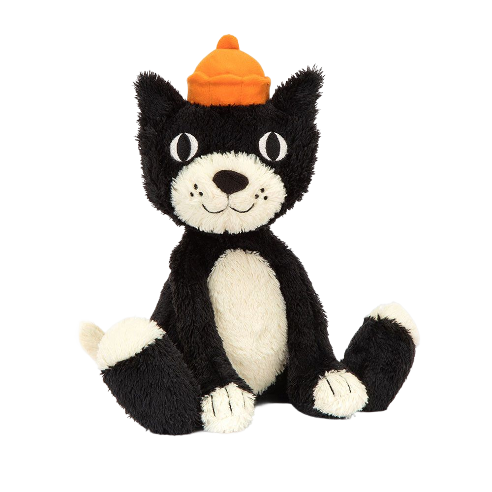
JellyCat Dream Lab Game
A soft, floral-inspired UI system built for warm, playful digital experiences. Muted purples, generous radii, and expressive type.
Colors
6 palettesPrimary — Purple Mauve
#f7f2f8
#eeddf0
#ddbfe0
#c9a0cc
#b388b5
#9a729c
#835c85
#6b496d
#533755
#3c2640
Secondary — Sage Green
#eef4f3
#d8eae8
#bad5d2
#97bdb9
#7aa89f
#68938a
#537b73
#40615b
#2f4844
#1f302e
#142020
#0c1413
Secondary — Amber
#fff9f0
#fff1da
#ffe4b3
#ffd488
#ffc96a
#ffc26d
#e8a748
#c48831
#9e6b21
#764f14
#52360b
#321f05
Tertiary — Periwinkle Blue
#f0f4fc
#dce8f8
#c4d9f2
#a9c5eb
#94b6e7
#83a8e2
#6289c8
#4a6dad
#355290
#223870
#152550
#0c1632
Semantic
#ff8175
#ffd5d1
#fff1ef
#40615b
#bad5d2
#eef4f3
#c48831
#ffe4b3
#fff9f0
#2c4e8a
#cddcf7
#eef4ff
Neutral
#fafafa
#f5f5f5
#e8e8e8
#d4d4d4
#808080
#2b2b2b
#1a1a1a
Typography
Cormorant Garamond + LatoThe quick brown fox
The quick brown fox jumps
The quick brown fox jumps over
The quick brown fox jumps over the lazy dog
The quick brown fox jumps over the lazy dog. Soft, warm, and inviting.
The quick brown fox jumps over the lazy dog. Perfect for paragraph text and descriptions.
The quick brown fox jumps over the lazy dog. Used for captions and supporting text.
Form label text
Caption text · metadata · timestamps
Spacing
8 stepsButtons
4 variants · 3 sizes · 4 statesPrimary
Secondary
Ghost
Danger
Badges
5 variants · 2 sizesSmall
Medium
Chips
3 variants · 2 sizesSmall
Medium
Interactive example — click to toggle
Cards
4 variantsDefault Card
Card description goes here. Uses muted floral palette tokens.
Hover State
This card is in its elevated hover state with a stronger shadow.
Pressed State
A subtle background shift indicates the pressed / active card state.
Card — Mobile
1 variant · w/ buttonCard Title
Card description goes here. Uses muted floral palette tokens.
Card — Visual Design
3 variantsDreamy Purple
A whimsical blend of lavender and violet, perfect for enchanting evenings and magical moments.


Warm Amber
Sun-kissed hues of golden amber and tangerine, radiating warmth and playful energy.

Ocean Teal
Refreshing tones of emerald and ocean blue, evoking calm seas and lush tropical escapes.
Inputs
3 sizes · 4 statesSelect & Textarea
Alerts & Toasts
4 variantsInfo
Success
Warning
Error
Tabs
3 variantsDefault
Pill
Underline
Form Controls
Checkbox · Radio · SwitchCheckbox
Radio
Switch
Feedback
Skeleton · ModalSkeleton — Text variant
Skeleton — Avatar variant
Skeleton — Card variant
Modal — Small (360px)
Modal Title
Modal content goes here. Add your description or form elements.
Modal — Medium (480px)
Modal Title
Modal content goes here. Add your description or form elements.